

Nero di Voghiera
Project
Nero di Voghiera
The project entailed creating the first real brand for Voghiera black garlic. Marketing needed to first identify a high-reaching, recognizable brand identity, then develop a powerful campaign that highlights the brand’s difference and promotes the black garlic culture and increase perceived value.

NERO DI VOGHIERA. A NAME, A PROMISE.
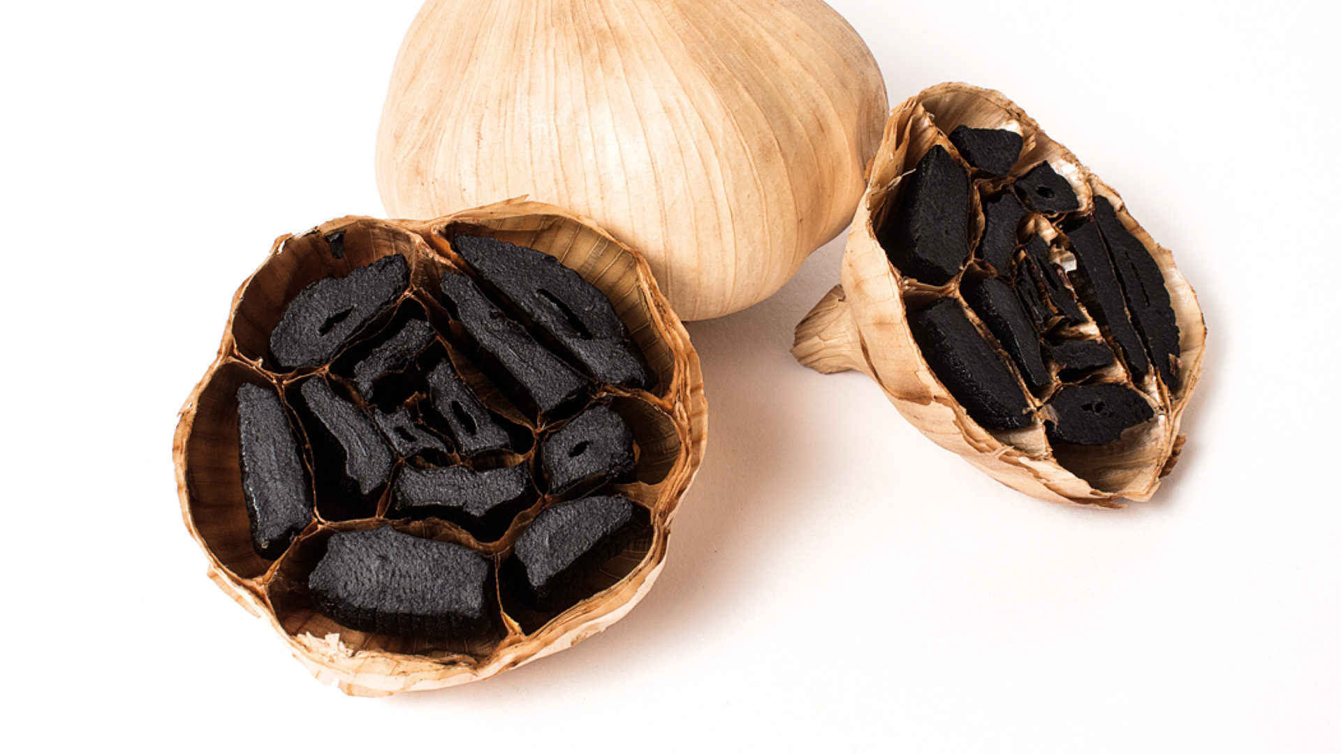
We started from the characteristic that identifies the product and that concept guided the development of the idea: the color black.
Black is the characteristic and unique color of this particular fermented garlic. “Black” is part of the brand name and the flag color of all communication. The choice of the name necessarily fell on the color, placing the accent on the first extrinsic property of a product of excellence that is Voghiera D.O.P*. garlic. The color “Nero” becomes a noun and the name of this superior quality garlic, which is black because it is fermented; black because it is unique. The incisive but minimalist style of the name maintains those same characteristics in the visuals: A section of garlic viewed from above, outlining the contours of what appears to be a flower. The image is as essential and elegant as the product it represents. *(Certified Designation of Protected Origin)

LESS PACK IS THE NEW BLACK
The coordinated image and the packaging design maintains the characteristics of the product and represents them graphically and chromatically: a refined and minimalist style, marked by essential materials and a choice to drastically reduce the amount of packaging, thus enhancing the product and its forms. The flagship color of the brand is predominant throughout the coordinated campaign, enriched by tones of pink, the color of the garlic flower, and Havana brown, the non-color par excellence, which brings to mind nature and the earth.

